Maugallato Logo
As designer I can say one of the most difficult works, was when I was trying to define my personal identity.At least I decided to used some elements, personally I don´t know if these elements represent me but I really want them to represent me.
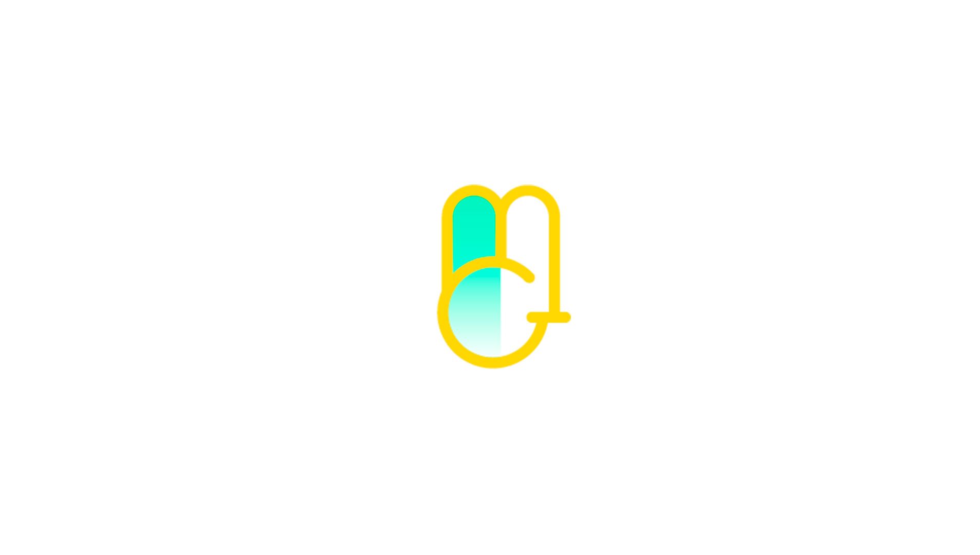
The first element is the color, I really like those brilliant and eye catching colors. I think the yellow part gives the logo a kind of elegance, and for me elegance is a synonymous of confidence, a confidence I want to transmit to everyone I work with. Blue color represent water that at the same time represents where I came from(Coast city) and how I see myself(I try to be always relaxed and I'm against violence)
The second element is the form, at first I tried to mix all my capital letters MGT(Mauricio Gallardo Torres), once I achiev that I realise that it looks as a lot of things, it could be a bunny, if you rotate it 180 degrees it seems like a little guy, but then when I was making the preloading screen I see that it looks like a hand, first I thought it looks like a peace sign.